The Typographic “Modern”
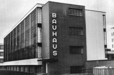
Above: The Bauhaus in Dessau, Germany.
To start, when I say the typographic “modern,” I don’t mean Modernity, even though the written distinction is typographic. The project of Modernity spanned a century or more; the novelty of modern typography lasted a few decades at best, and had its heyday in the latter half of the twentieth century, in the twilight, or perhaps even in the aftermath, of the Modern Age. Typographic theorists and thinkers were far less acclimated to philosophical tracts than they were to artistic manifestos, which were themselves generally non-comparative and often stridently rhetorical. So, as the manifesto-writers repackaged the philosophers, the typographers repackaged the manifesto-writers, and, here we have typography in its typical position: twice-removed. Contemporary designers Ellen Lupton and J. Abbott Miller explain, “writing is […] a set of signs for representing signs. The design of letterforms is removed one step further: it is a medium whose signified is not words but rather the alphabet.”
This position is not limited to form, however, it extends into the realm of content, for typography, as a commercial art, is generally tied to the co-opting processes of Capitalism, which move slowly as a necessary condition of the marketplace. In her introduction for a collection of posters by Cuban revolutionaries, Susan Sontag writes,
The poster has always been parasitic on the respectable arts of painting, sculpture, even architecture. […] As an art form, posters are rarely in the lead. Rather, they serve to disseminate already mature elitist art conventions, […] popularizing what is agreed on, by the arbiters of the worlds of painting and sculpture, as visual good taste.
In light of this sluggish distance, one is tempted to question the worthiness of charting a constellation of typographic claims in the Modern universe, even though such claims may very well exist in theory, like a star whose presence is known by its disturbance of other stars, though the star itself is unseen.

But the charting of stars is itself a typographic activity, and, seen or unseen, the disturbance here is significant, for typography, despite its “modern” practitioners’ claims of transparency, is anything but. “To the famous maxim, ‘Good typography is invisible,’” writes Dutch Typographer Piet Schreuders, “one might add: ‘Good typography is secret.’”
Here, despite its conceptual jet lag, typography catches up with Modernity in by a similar kind of proliferation of “truths.” What qualifies as a “natural” form, for instance? Who practiced “primitive” typography? How is an “organic” page shape created? What kinds of criteria govern the “legible”? When is a layout “kinetic” and when is it “optical”? What makes a typeface “universal” and a style “international”? Thus, in the hierarchy of ideas, typography is often a deciding factor, imbuing the Platonic “form” of written language with a set of codes that say something their text often does not. Far from invisible, modern typography is wholly self-reflective, considering and reconsidering itself in terms of Modernity in a way that is significant, and, in terms of one of its axioms, “un-justified.”
Finding a quintessential example to stand for the whole modern typographic endeavor is certainly a useless task, for even the obvious choices are less than exemplary. Posters of the Russian Constructivists and books of the Bauhaus, while they are classified as modern typography, are thoroughly diversified both in terms of their artistic aims and their visual forms. The publication of Jan Tschichold’s Die neue Typographie in 1928, though it articulates reasons for founding principles such as asymmetric grid structures and sans-serif typefaces, was rejected several years later by its author as a piece of “juvenilia” when he went to work for Penguin Books, where his subsequent work exhibited a kind of solitary neoclassicism.
As with so many things, a succinct – though not necessarily whole – embodiment of typographic modernism was not to come until just before the movement’s demise. The publication of die neue Graphik / the new graphic art / le nouvel art graphique by Karl Gerstner and Markus Kutter in 1959 provided a kind of universal history, organized as follows: the primitives (actually their contemporaries, practicing a kind of typography that would now be described as “vernacular”), the beginnings (from early fifteenth and sixteenth century makers’ marks to the posters of Toulouse-Lautrec and Art Nouveau), the break-through (all posters, for machinery, travel, and politics from 1930-1945), the present (work from France, Britain, Germany, Switzerland, and America from 1945-1959), and the future (work from the Allgemeine Gewerbeschule Basel [AGB] from the last five years). Both Gerstner and Kutter taught at the AGB with its founding fathers, Max Bill, Armin Hoffman, Josef Müller-Brockmann, and Emil Ruder, who was the first to come to the school and revolutionize its design department in 1942.
Gerstner and Kutter’s “future,” a branch of modern typography which came to be known as “Swiss Typography,” had, since its first theoretical articulation in Max Bill’s “Uber Typografie” in 1946, become a global phenomenon whose reach was greater than any typographic movement before or since. In every prior defense of modern typography, the tenets of classical typography had thoroughly accounted for and rejected. In die neue Graphik, the “classical” is circumvented entirely, the authors instead bartering the term “primitive” and showing the latter’s perversion by the former and its accurate manifestation – indeed, its logical conclusion – in the present, modern work of the hard-working men in Basel. Ten years after die neue Graphik, and twenty-five years after the movement started, one of these men, a junior faculty member at the AGB, a German named Wolfgang Weingart, went on a speaking tour in America to denounce the teachings the “Swiss Typographers,” and to ask the question, “How can one make ‘Swiss Typography’ at all?”
Of course, in the minds of the Swiss Typographers, it was impossible to make anything but. To them, everything “useful” (beauty was not an issue) led up to Swiss Typography, and everything else failed to qualify. Thus, the entire modern typographic movement was leading up to the Swiss style, and with its articulation came a call not for further refinement, but, rather for widespread standardization and implementation. If, as Le Courbusier suggests, “the plan is the generator,” then the plan had been generated, and it was time for the rest of the world to get moving. Indeed, despite its nationalistic moniker, Swiss Typography was adaptable to every design situation in every country on the globe.
In terms of modern typography, global reception was the plan from the beginning. Writing at the dawn of the movement in 1923, El Lissitzky envisioned the “Topography of Typography” as spatial and visual, rather than temporal and auditory. He writes, “words on the printed surface are taken in by seeing, not hearing,” and, later, that one should favor “optics not phonetics.” This reformulated “book-space” is joined with technology to exploit “the constraints of printing technology,” of the machine, making the book a machine for reading and for meaning-making. Lissitzky personifies the bilaterally symmetric open codex as a pair of eyes looking out, the “bioscopic book,” a technology in and of itself, which demands for itself a new writer, for “the inkpot and quill-pen are dead.” The final phrase, a typographic fragment in all caps, reads: “THE ELECTRO-LIBRARY,” with no further explanation. This seemingly cryptic image finds resonance almost half a century later, Michel Foucault writing in The Archaeology of Knowledge evokes this networked ideal once more,
The frontiers of the book are never clear-cut: beyond the title, the first lines, and the last full stop, beyond its internal configuration and its autonomous form, it is caught up in a system of references to other books, other texts, other sentences; it is a node within a network […] The book is not simply an object one holds in one’s hands; […] its unity is variable and relative. As soon as one questions that unity, it loses its self-evidence; it indicates itself, constructs itself, only on the basis of a complex field of discourse.
Foucault moves outward from form to content and then further outward from content to context. Seen through this lens, the book is not a classical object but a modern technology of the most valuable order.
Though Foucault and Lissitzky ask us to consider it otherwise, and although this consideration is an important one in the theoretical framework of modern typography, let us consider die neue Graphik as an object for the moment, anyway. The book embodies the now-iconic Swiss style. It is square-format, the cover is type-only, black on white, photographs are printed hard and always cropped in a square, and its structure comes from a three-column typographic grid in which German, English, and French run simultaneously. Paragraphs are not indented but given a full carriage-return and always line up at their beginnings, creating strange gaps in the otherwise even dark gray of Akzidenz Grotesk. English typographic historian Robin Kinross describes the typeface as “bearing the stamp of anonymous, vernacular authenticity,” and goes on to describe how it was marketed in the United States simply under the name “Standard,” bringing us away from the objective and right back to the universal.
What qualifies any typeface as “standard”? Akzidenz had been nonexistent a century before, and there was certainly no one clamoring for it then. When it was ultimately released, it was categorized in the German typographic subclass of “Grotesk,” or bastard versions of the alphabetic letter. The qualification was partly due to its marketing: “Standard” projected a kind of manifest destiny onto the typeface of what it was supposed to become. And the qualification was partly due to the modern typographers’ systematic introduction of typefaces that dove-tailed with their objectives. These were: favor types that display the aesthetics of the machine over the aesthetics of the hand; favor types that have an even color when set so that they minimize visual differences between German (with many capital letters), English (with few), and French text (with many diacritical marks); favor types with monospatial (every letter the same width) or nearly monospatial proportions for ease of setting; favor type that prioritizes the “optical,” or specifically visual aspect of its communication; favor types that promote “legibility”; and, finally, favor types with a modular construction so as to allow for infinite variation.
Some of these goals were expressed as early as 1925, When Lázló Maholy-Nagy coined the term “typophoto” in an essay of the same title to suggest that typography should become more like photography in its aims. He writes,
Typography is communication composed in type. Photography is the visual presentation of what can be optically apprehended. Typophoto is the visually most exact rendering of communication.
Demonstrating his ideals by punctuating his text with large, solitary, oversized periods for increased visual impact, Maholy-Nagy’s concept of “typophoto” looked unlike anything that came before it and ushered in a new style for members of the German avant-garde, and particularly at the Bauhaus, where Maholy-Nagy was affiliated.
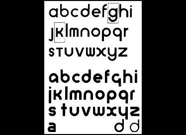
Above: Herbert Bayer’s universal alphabet.
Ten years later, another Bauhaus member, Herbert Bayer, writing from Nazi Germany, brought the modern typographic debate into a new ream by arguing that, rather than simply emulating photography, modern type should respond to the changed language of modern times with new visual forms. Unlike the Swiss Typographers, Bayer does not dismiss the influence of classical or gothic typography as part of his argument; rather, he implicates these as stylistic trends whose time has passed. He writes, “classical roman type, the original form of all historical variations of type, must still be our starting point,” then, later, that
albrecht dürer’s endeavors to resolve both the roman and gothic type into their constructive basic elements, unfortunately were never carried beyond their experimental stage.
Eventually, though, Bayer abandons searching for the modern in the classical, ultimately resolving that the new language of modernity requires a “new alphabet,” the conditions of which he defines, “geometric foundation to each letter, resulting in a synthetic construction of a few basic elements, avoidance of all suggestion of a hand-written character, uniform thickness of all parts of the letter, and renunciation of all suggestions of up and down strokes. simplification of form for the sake of legibility.” This final statement, leading him to question why “we write and print with two alphabets,” causes him to call for the “new alphabet” to be a “one-letter type alphabet, composed entirely in the lower-case.”
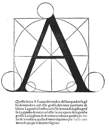
Above, top to bottom: Alphabets by Fra Luca de Pacioli (c. 1500); Albrecht Dürer (1525); and Geoffrey Tory (1529).
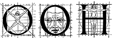
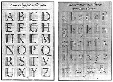
Bayer’s arguments in “Towards a Universal Type,” then, exemplify many modernist attitudes towards typography as well as helping to solidify an already incumbent shift from the fastidious construction of individual letters to the more abstract ideal of the letterform. The former attitude, that of individual letter-constructions, came as part of the Platonic ideal of a “perfect alphabet,” in which each character is balanced according to the measures of Euclidean geometry or the human body, which was created by God. Leonardo da Vinci and Fra Luca de Pacioli’s constructions came earliest, around 1500, followed by Dürer’s constructions of roman majuscules and blackletter lowercase in 1525. Geoffrey Tory’s alphabets of 1529 followed in this tradition, composing majuscules out of the artists’ tools (particularly the compass) and the proportions of the human body. Palatino’s constructions, published in 1540, further developed the work of his countrymen da Vinci and Pacioli, and were perhaps the most elegant of them all.
Above: The romain du roi alphabet (1693).
Things began to change by 1693, when a committee established by Louis XIV created the romain du roi by imposing an orthogonal grid over the more organic forms of traditional lettering. This grid surveyed all letterforms in order to create an “ideal” letterform that was maximally readable and recognizable to the kingdom and to the world over as France’s distinctive typography. Lupton and Miller write,
While the humanists had hoped to discover absolute proportions legislating the forms of letters, […] the creators of the romain du roi pursued a norm grounded in scientific and bureaucratic legality.
This legality came, in part, from the king (it was his typeface, after all) and, in part, from the grid. This Cartesian plane, this grid, would reshape much of Modernity in general and modern typography in particular. With it came the notion that typographic units were not as much relational within individual letters but across a whole typeface, or series of similar typefaces (a “family”), and even across the page. The letters would be made up of the same units of width and length as the strips of lead that spaced the lines, or locked the margins, or whatever. This was the point-pica-cicero system of typographic measurement, which was based on the French inch, which was based on the body of the monarch, and it is still in use today. Its first widescale application was not in the romain du roi, which was eventually cut in 1723 by Martin Dominique Fertel; rather, it was in a typeface cut in 1784 by François Ambrose Didot and eventually named for its creator. Kinross explains,
“[M]odern” has come to be used to describe that category of type design whose beginnings may be seen in the romain du roi, and whose first proper appearance […] has been located in a type of François Ambrose Didot.
The categorization of Didot’s type as a “modern” one came within a quarter-century of its release and because of both its modeling on the point-pica-cicero system and its reduction of the alphabet to a set of basic oppositions: thick and thin, vertical and horizontal, serif and stem. The letterform – or the view that the alphabet is a set of essential, archetypal units within a larger set of formal features including weight, stress, cross-bars, serifs, angles, curves, ascenders, descenders, and apertures – was born. Here was not a static body of single letters, each drawn according to its own individual geometry; instead, here was a set of features that could be infinitely recombined: a type “set” instead of a set type.
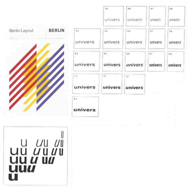
Above: Specimens for the typeface Univers, by Adrian Frutiger (1956).
Thus, via the concept of the letterform, Didot’s typeface begets Bayer’s, and Bayer’s begets those typefaces of the Swiss Typographers, the two most important of which, other than Akzidenz Grotesk (cut before Ruder’s arrival at the AGB), were Univers and Helvetica. Designed by Swiss punchcutter and semiotician Adrian Frutiger, Univers follows directly from Herbert Bayer’s statements about “universal” typography: the letters are made of a few basic shapes, composed on a simple grid, relatively unvarigated in their strokes and highly permutaional, comprising, in total, a family of 21 basic variants, keyed by an index number to stroke thickness, slope, and character width. Ruder embraced immediately, even using early, unfinished versions to set his monograph Typographie, as well as all of the subsequent materials for the AGB. Nearly identical to Univers, though not as interesting typographically, is Max Miedinger’s Helvetica. Miedinger’s education was not as thorough nor his legacy as diverse as Frutiger’s, but, while Univers was becoming the norm all over Europe, Helvetica, which took advantage of the Latin name of its country of origin, Switzerland, rather than its country of issuance, Germany, was not popular in either country, largely because of its rather “dumb” appearance. Univers, though fussy to set, had character, craftsmanship, and refinement; Helvetica, much easier to set, was categorized as a “bastard grotesk,” a distant cousin to the “pure” grotesk of Akzidenz, because of its boring, blunt, and monotonous tone.
Despite its unpopularity in Europe, Helvetica became the best-selling typeface in the history of the United States, and, though there are reams of design writing and even a book called Helvetica: Homage to a Typeface, devoted to pondering the reason for its immediate popularity, this reason is not difficult to understand. Consider its foundry’s description of it: “[Helvetica is] a perfectly neutral typeface without any overtly individual forms and without any personal idiosyncrasies.” Writing for the Village Voice in 1976, columnist Leslie Savan claimed that Helvetica “IS CHANGING YOUR LIFE” by creating a cult of sameness that made the messages of Chase Manhattan Bank visually equivalent to those of Coca-Cola, fostering a kind of corporate modernism in which the communiqués of global capitalist empires are virtually indistinguishable. Of course, the message was one-in-the-same, anyway: “realness,” “trust,” and “cleanliness.” By being boring, the countless number of corporations using Helvetica were, in the worst case, barring any unwanted attention to themselves in particular, and, in the best case, free-riding off other corporations’ messages as part of their own. Savan writes, “companies […] that are finding their identities […] are doing so by looking more and more alike. A unilook for Unicorp.”

Above: Lupton and Miller’s “Helvetica Man,” a.k.a Massimo Vignelli’s male “symbol sign” (1974–9).
Pulitzer Prize winning designer James Wines takes it a step further: “Helvetica is part of a psychological enslavement. It’s a subconscious plot: getting people to do, think, say what you want them to. It assumes you accept some system.” The system, of course, was Swiss Typography, and its use, flown overseas, had revealed the potential of modern European utopianism to the mercantilist regimes of the United States. Soon, American designers like Massimo Vignelli were riffing offof the faculty at Basel, developing vast “symbol-alphabets” both for megaclients like IBM and even the U.S. Department of Transportation to as nonverbal compliments the many “neutral” Swiss typographic forms. The “Helvetica Man” had made his first appearance, a way of envisioning the human body that, stripped of any individual essence, was anything but humane.
Designers in the United States, though at first resistant, began to make sense of this work as an extension of the Bauhaus’ teachings. Needless to say, training in this work was particularly emphasized in American institutions with pre-existing ties to the Bauhaus: Parsons School of Design in New York, the Illinois Institute of Technology, and, the most influential of all of these, Yale University. European modernism had flourished at Yale since Josef Albers’ arrival at the art school, but, by the time Swiss Typography had become an international style, one would have a hard time finding anything resembling the offbeat modern graphics of teachers like Paul Rand and Bradbury Thompson coming out of Yale’s students. Albers recruited Armin Hoffman to come to the program and adapt his course on typography from the AGB. The Yale Summer Program in Basel was established and a mandatory residency enforced. Having deemed advertising work “amoral,” Swiss Typographers at Yale were recruited in droves to work at major “identity placement” firms such as Massimo Vignelli’s Vignelli and Associates or Tom Geismar’s (another Yale professor) Chermayeff & Geismar, and spent their twenties and thirties mired in endless usages and standards manuals for Fortune 500 companies that quickly became dated and useless. The most prominent of these designers, Dan Friedman, would spend much of his life creating a visual regime for Citibank, only to disown much of this work just before his death of AIDS in the early 1990s.
Vestiges of Swiss Typography linger in the air at Yale; meanwhile, a sort of neo-Swiss style is back, particularly in techno music and electronica or on MTV, where young designers see it as “retro chic,” being relatively unaware of its history within the greater history of modern graphic design. This is, I think, because the Swiss Typographic movement has not been properly historicized. But it is also due to the fact that the era of modern typography ended with less of a bang than a whimper. The Swiss method was too extreme, too totalizing, for an American audience, and, soon after its export to the states, the needs of an ever-hungry graphic audience were ultimately satiated by the postmodernists at Cranbook, Michigan, or by the playful parodies of Swiss forms by Wolfgang Weingart. A new humanism was coming to graphic design, ready to replace the icy impersonality of late Modernity with a vulnerability and sincerity unseen since the demise of the Arts-and-Crafts movement at the start of the modern typographic era.
This turn was anticipated as early as 1949, when György Kepes, a Hungarian émigré teaching at MIT, delivered an address at Harvard about the role of Functionalism (similar to Structuralism) in “Modern Design.” Kepes writes,
We tend to mistake the slogan for truth, the formula for the living form, the repetition of habit for cultural continuity. Inertia leads us to carry this dead body of lifeless thoughts around with us […]. Vigilance is needed [to combat] the intentional misuse of words and ideas.
He goes on to remind designers that
[D]esign is not for design’s sake, […] design is for man. Man was at the root of [the ancients’] thought, and human function gave direction and measure to whatever they were doing [… Now], we’d rather see what we are looking for […] We are passive men, lazy men, armchair onlookers […] We must find those feelings in which and through which man’s bonds to nature and to other men can again be experienced [… In doing so], we can bring back the truest meaning of tradition, which is to realize in terms of today a living continuity with the genuine values of the past.
Kepes’ words anticipate the condemnation of Helvetica over 25 years later, when, around the same time, architect Robert Venturi offered this statement to an audience of fellow architects in Berlin during a talk called “Functionalism, Yes, But,”
Functionalist architecture was more symbolic than functional. It was symbolically functional. It represented function more than resulted from function […] But the symbolism of functionalist architecture was unadmitted. It was a symbolism of no symbolism […] Aesthetic qualities, if ever mentioned, were said to derive from the easy resolution of the never contradictory functional requirements of a program.
Functionalist/Structuralist ideologies were the zero-point of modern typography, and Swiss typography was the apotheosis of Functionalist/Structuralist ideologies.
This reductivism and Helvetica de-humanization of the design process were countered with a new awareness of the “vernacular,” and, when Venturi and other Americans went to “learn from Las Vegas,” Europeans followed suit, trying to reclaim the subconscious systems of semiotic encryption that govern a functioning “low” culture. Piet Schreuders, who, at the start of this discussion described how “good typography is secret,” was one such European vernacularist. His aping of the “high” modernists in the subversive pamphlet, “Lay In-Lay Out,” the title of which is derived from a Johnny Mercer song, is worth including here:
the ‘Swiss’ dogma turned out to attract additional hordes of idlers, car drivers, managers, dimwits, accountants, and copycats, so that “Swiss” typography, if it ever amounted to anything, soon developed into a pseudo-religion. Suddenly the graphic profession was overcrowded with fast-talking men in loud neckties who proceeded, as if remotely activated by the mother lode in Zurich, to restyle airports, show programs, newspapers, and labels. No single fashion has ever been as overpowering as the fashion of restyling, and once a restyling process was underway, it became easier and easier to re-restyle the same things again and again. Finally, the point was reached where all existing graphic design had been reduced to either a period point, a line, or a paper clip.
Schreuders’ final images – a stop, a continuum, and a connector – suggest a relationship to the formal mechanisms of history, and that the project of “Swiss Typography” was not simply the crafting of an iconic, teachable, wholly reproducible style (though it was that). It was also the crafting of a history for the modern typographic movement, a history in which all roads led to Basel.
Wolfgang Weingart’s speaking tour of America included a stop at Yale, where he gave the “How Can One Make Swiss Typography” talk, which begins, “I am happy that I can be with you today, especially because your invitation has given me my first opportunity to visit America.” So, while he came in part as an emissary for a school whose teachings he would eventually overthrow, he also came as a tourist. The poster for the talk, which featured typewriter type blown up with a stat camera and pasted of Weingart’s own goofy expression, was silk-screened and quickly became a collector’s item among the art students whose schools were included on the tour. Again in her essay on Cuban revolutionary posters, Susan Sontag provides a paper clip for poster collecting and tourism. She writes,
It is hardly accidental that the beginning of the craze for collecting posters, in the mid-1950s, coincides with the rising tide of postwar American tourism in Europe […] Posters furnish a portable image of the world. […] Poster-collecting is related to the modern phenomenon of mass tourism […] The poster becomes a souvenir of an event [… a] substitute for experience.
die neue Grafik, its content almost entirely posters or poster-like graphics, is just such a substitute. It is part of the Paul Rand Collection in Sterling Memorial Library’s Arts of the Book room. Weingart’s poster is also part of the collection, and, just this year, both items have been reprinted by the same art press in Basel, owned by AGB graduate Lars Müller. Portions of die neue Grafik were reprinted as part of Josef Müller-Brockmann’s monograph, Pioneer of Swiss Typography. The Weingart poster was reprinted in Weingart’s monograph, a response to Ruder’s of 33 years before, was called My Way to Typography, and documents Weingart’s artistic evolution and typographic coming-of-age from boyhood fascinations with cobblestone block patterns and bicycle spokes to the cultivation more academic interests, like intaligo printing and photo-typesetting. Müller-Brockmann’s monograph is heroic and nationalistic. Weingart’s is humanistic and even intimate. I purchased both at a small San Francisco art book dealer on my way to my final year of college, and I am looking and thinking about them still. Link: